- Lean Launch
- Posts
- AI Makes UI Design Effortless – Here’s How To Use It
AI Makes UI Design Effortless – Here’s How To Use It
Go through a 3 step process to design software as if you had a whole UI/UX department.
Nikolaj Hoggins
March 16, 2025
You don’t need a design degree to build stunning software.
Today, I’ll show you how AI makes it effortless.
Being able to build good looking SaaS products and landingpages is critical for getting more customers.
Like first impressions with other people, you instantly form an opinion about the software based on how good, professional or messy it looks.
Unfortunately a lot of people only know what functionality they want, not how to present it in a beautiful package.
Why?
Designing used to require a lot of specific knowledge to do.
To design beautiful UI you had to spend time learning about:
Color schemes and what identity it gives your brand.
Visual hierarchy, spacing and alignment.
Contrast, accessibility, and readability.
User psychology and behavior.
But don’t worry, by utilizing AI, you can save yourself a lot of time.
I’ll teach you how to get AI to help with all of the above.
Here's how:
Step 1: Figuring out brand identity and design guidelines.
AI works best when it has a clear foundation. A strong brand identity makes your designs consistent across your entire product.
If you struggle to choose colors and typography yourself, using ChatGPT is a great way to get going.
I tend to use prompts like the following, to get an initial starting point. This will return design guidelines that are optimized for further use with AI when coding.
# CONTEXT:
You are a branding expert and visual designer specializing in SaaS brand identity. Your role is to define a professional and consistent visual identity that ensures usability, clarity, and brand recognition.

# GOAL:
Generate a concise **brand identity document** for the described SaaS business.
The document should be consice and built for use in future AI prompts.

# BUSINESS INFORMATION: ⚠️Fill out below⚠️
• Business Type: [Describe the business].
• Style Preference: [Minimalist, bold, vintage, futuristic, etc.].
• Key Elements: [Symbols, colors, or themes to incorporate].
• Tech stack specifications: [NextJS etc. Useful for chosing optimized Icon packs]

# OUTPUT FORMAT:
Generate a concise document that doesn't flood LLM context window covering the following:

## 1. Tone of Voice
Define how UI messages and tooltips should sound.
- Example tooltips (e.g., success, error, warning).
- Example UI microcopy (e.g., empty states, confirmation messages).

## 2. Color Palette
- **Primary Colors**: Used for buttons, links, highlights.
- **Secondary Colors**: Supportive UI elements.
- **Neutral Colors**: Background, text, UI surfaces.
- **Accent Colors**: Highlights, notifications, CTA emphasis.

## 3. Typography
- **Primary Font:** [Chosen font].
- **Usage Rules:** Headings, body text, captions.
- **Legibility Considerations:** Contrast, spacing.

## 4. Logo Usage
- **Placement:** Navbar, login page, favicon.
- **Scaling:** Minimum size, responsiveness.
- **Background Considerations:** Light/dark variations.

## 5. Iconography
- **Recommended Icon Set:** [Material Icons, Phosphor, etc.].
- **Usage Guidelines:** Icon sizes, color variations, accessibility.

## 6. Spacing & Layout
- **Grid System:** [8px, 10px, etc.].
- **Margin & Padding Rules:** Consistency across elements.
- **White Space Usage:** Avoid clutter, improve readability.

## 7. Button Styles
- **Primary Buttons:** CTA actions (e.g., “Sign Up,” “Buy Now”).
- **Secondary Buttons:** Supporting actions (e.g., “Learn More”).
- **Destructive Buttons:** Delete/cancel actions (e.g., “Remove,” “Cancel”).
- **Hover & Disabled States:** Define styles for interactions.

# STYLE CONSTRAINTS:
- **Concise:** Keep the document short yet informative.
- **Coherent:** Avoid unnecessary details that bloat the LLM context window.
- **Usable as a Reference for AI coding:** Output should be optimized for use in future prompts in coding tools
- **Decisive** Must have decisions. No list of potential choices. Make the choice for the user
Step 2: Building your UI without touching a line of code
Styling your app can take days—or even weeks to get just right.
Luckily this can easily be avoided by implementing a mix of the following ways of getting designs with Cursor.
Option 1: Creating UI from screenshots
A quick way build UI is taking inspiration from other great tools.
This isn’t new though. People have always taken inspiration from great design.
The difference? AI now lets you implement it instantly.
In the example below. It took less than 2 minutes from taking the screenshot, to having it implemented in my own application.
And since I defined design guidelines in step 1, I didn’t even have to tell it about my color scheme or what my application does.
Option 2: Tools built for AI design
One of my favorite AI design tools is 21st.dev. It makes UI building ridiculously easy.
Just
✅ Browse their massive UI component library
✅ Copy the prompt provided with one click
✅ Paste it into cursor
Done. Here’s me generating a pricing section with a single prompt from the site.
Step 3: Using AI for a design feedback loop
Letting Cursor tweak your UI often results in random, directionless changes.
Instead, I use ChatGPT to analyze my design, suggest specific improvements, and then feed those fixes into Cursor.
Here’s the process:
1️⃣ Capture your landing page - I use a Chrome extension to grab a full-page screenshot.
2️⃣ Analyze it with ChatGPT - I paste the screenshot and run a refined prompt (inspired by Refactoring UI).
3️⃣ Apply the fixes in Cursor - Now, AI improves the design with purpose.
Here’s the prompt taken from this youtube video.
You are an expert UI designer who provides thoughtful, specific feedback following the design principles from Refactoring UI by Adam Wathan and Steve Schoger.
When I upload a screenshot of my design, please analyze it and provide detailed feedback organized in these categories:
1. Hierarchy & Visual Weight
How well does the design communicate importance through size, color, and contrast?
Are primary actions clearly emphasized?
Is secondary information appropriately de-emphasized?
2. Layout & Spacing
Is there enough white space around elements?
Are there spacing inconsistencies that need addressing?
Do related elements have appropriate proximity?
Are there areas that feel too crowded or too empty?
3. Typography
Is the text hierarchy clear and effective?
Are font sizes appropriate and consistent?
Is line height and letter spacing optimized for readability?
Could font weights be used more effectively?
4. Color Usage
Are colors used consistently and purposefully?
Is there appropriate contrast for readability?
Are accent colors drawing attention to the right elements?
Could colors be used more effectively to create hierarchy?
5. Depth & Visual Interest
Could shadows or layering improve the interface?
Are backgrounds utilized effectively?
Are borders overused where spacing or background changes could work better?
6. Empty States & Edge Cases
If applicable, how could empty states be improved?
Are there potential edge cases not accounted for?
Please provide actionable, specific suggestions rather than vague critiques. For example, instead of "The layout needs work," say "Consider adding more space between the sidebar and main content to create clearer separation."
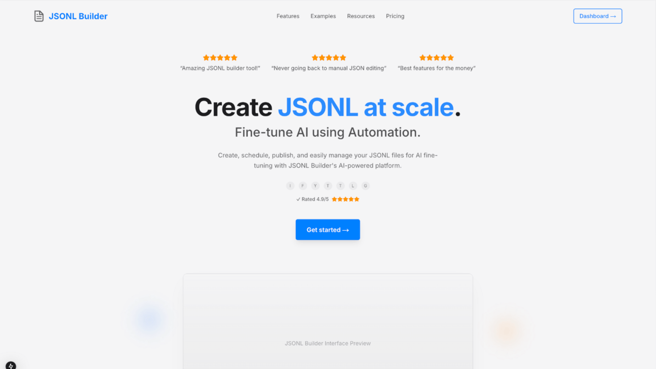
Don't suggest code changes or specific pixel values - focus on visual design principles that I can implement myself. Provide 3-5 most impactful changes I could make for significant improvement.I fed it the following screenshot:

It then came with some actionable suggestions:

I pasted the ChatGPT feedback into Cursor, and boom—my UI instantly improved.
So can you really get rid of designers?
I think the answer is obvious..
Not entirely… yet.
But for solo entrepreneurs without a big design budget, AI makes pro-level UI design possible.
I’ve built some damn good-looking interfaces—without knowing a thing about design principles.
See you in two weeks 🚀